Monday, May 30, 2011

Styles for Many Reasons…Note Styles

I haven’t addressed adding footnotes or endnotes yet. They are easy to do—that is, easy to insert in a Word document but not necessarily easy to write. The styles associated with these types of notes work similar to other automatically applied styles in Word. When you add the element to a document, Word applies a default style for you. You’ve already seen these types of styles for a table of contents or an index, where Word automatically applies the style when you add the element to a document.

Generally speaking, automatically applied styles do not appear in lists of Recommended styles (the default list when you open a new document). In the case of footnotes and endnotes, the style appears in the Recommended list after you insert the element into a document.

After the style appears in your list, you can make changes to it like you would any other style. For example, you might want to add color to the notes for a document you are going to PDF and post to the web. We haven’t discussed changing styles yet. We’re going to do so. I’ll break down what you can do and hopefully tell you why you should care.

Now personal opinion…As a general rule of thumb, I don’t use footnotes or endnotes. I find them distracting. Instead, I use inline references, which are abbreviated references associated with a bibliography that appears at the end of a document. If my reader is driven to know where I found the info, they have the source without my citation of the source info interrupting their reading. 

Other writers I’ve spoken with maintain that footnotes or endnotes lend a scholarly credibility to a document. Of course, you are free to do as you please. However, you should be aware of the schools of thought and make a deliberate choice for your documents. You might want to do some googling on the topic before you make a decision. 

Wednesday, May 25, 2011

Styles for Many Reasons...Styles with Numbers

When you see a style with a trailing number in the Styles pane, the number frequently refers to an indention hierarchy. For example, consider the List style.
  • List is flush with the left margin.
  • List 2 is indented .25 inches from the left margin.
  • List 3 is indented .50 inches from the left margin.
  • List 4 is indented .75 inches from the left margin.
  • List 5 is indented one inch from the left margin.
If you want a list that is indented .50 inches from the left margin, apply the List 3 style to your text.

Any style with a trailing number may have many other attributes (like bold or italic) applied to it; however, the number almost always implies that the style is progressively indented.

Notable exceptions exist. Heading, TOC, and Index styles are not usually grouped with the type of styles being discussed in this post.

When you're considering using one of the trailing numbered styles, you can pick any style to get the desired results. No rule says that you have to use List 3 before List 4 or vice versa. You pick the style that gives you the text position you want. Again...the word processor doesn't care which style you pick to present text. You are free to pick the style that gives you the desired result.

Being able to pick styles gives you the freedom to create nested lists.


In this example, I've turn on the hidden codes so that you see the paragraph marks, spaces, tabs, etc. In addition, I've added the style names (in blue text) I picked to get the presentation of the information. Be sure to note that the paragraph mark at the end of the paragraph includes all of the formatting for the text that appears before it. So the paragraph mark behind Jones, the last entry on the list, has the characteristics of a List Bullet 2 style because those characteristics are embedded in the paragraph mark behind Jones.

The following example shows how the same text looks with the hidden codes turned off.


This view is what you would normally see. Again, you need to know about the hidden codes when something goes wrong and you're trying to fix a document.

More about styles later. Right now you need to play with the styles that have numbers behind them to see what they do. Depending on what you are doing, you may have no use for this type of style or lots of use for this type of style. Again...the word process couldn't care less which styles you use or the order in which you use them.

Monday, May 23, 2011

Styles for Many Reasons...Body Text styles

Normal style
This style is the default style that is used when typing text. Lots of Word users never have the Normal style appear in their documents. They instead select the Body Text style for running text. Since the Normal style is the base style, the feeling is that you need to avoid using it...and changing it so that you don't corrupt your document or the associated template. I happen to ascribe to this style theory. Therefore, you won't find the Normal style used in my documents.
Note: Remember that every document is based on a template, which you can corrupt.

Body Text style
This style is the one I use for running text. If I make changes to it, my chances of corrupting anything (document or template) is slim.

Body Text 2 or 3 style
These styles are similar to Body Text. The difference may be that one is double spaced while the other uses a smaller font size.

Body Text Indent styles
The indent styles offer you a number of pre-formatted indented text. Some indent the entire paragraph, while others indent only the first line.

Block Text style
This style is a cousin of the indent styles but it has a special use. When you have a quote that goes over five lines, normal custom is to put it into a paragraph of its own. To separate the paragraph from other text, it is indented 1/2 inch on each side and sometimes placed in a decorative box. You can of course set this up yourself. However, with one click you can apply the Block Text style and get the same result.

Quote style
This style can also be used for quotations. When you apply it to text, the font changes to italic; however, you do not have the 1/2 inch indents from each margin nor do you have the decorative box. It's a matter of personal preference on which style you use for quotations. Just be sure to be consistent; that is, use Block Text or Quote for your quotations.

Reminder...Applying a Style
Type text for a paragraph, press the Enter key, click anywhere in the text, and then click a style to change how your text looks.

To apply a style to more than one paragraph, use your cursor to select the paragraphs, and then pick a style from the style list.

More about styles in my next post...

Sunday, May 22, 2011

A Style for Every Season

So far you’ve only seen a few styles. Word has many styles. As a genealogist, you’re probably only going to use a few of them. However, based on my recent exchange with Bonnie, some of you may be running businesses, which expands your need to know about the many other styles that Word offers.

To see all Word styles:

Word 2003
1. Select Format, and then Styles and Formatting to display the Styles and Formatting pane. If you’ve been playing around with styles, you may or may not see all available styles depending on selections you may have made.
2. Select All Styles in the Show options at the bottom of the pane.
3. If you still don't see your style listed, under Show, click Custom. A dialog appears.
4. Add a check mark beside the styles you want to see, click OK, and then select All Styles.

Word 2007/2010
1. Select the Home tab, and locate the Styles group.
2. Click dialog launcher (the small arrow in the lower right of the box). The Styles pane appears beside your document.


Note: You can also press Ctrl + Shift + S to display the Styles pane.

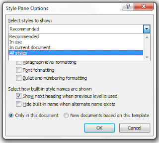
3. Click the Options link at the bottom of the Styles pane. The Style Pane Options dialog appears.


4. Select All Styles from the Select styles to show drop-down list.
5. Click OK. The Styles list updates to include every pre-defined style that Word offers.

It’s going to take quite a while to explain when and why you would want to use these styles. However, a few of them should already be in interest to you.

For example, if you generate an automatic table of contents based on heading styles, you get your table. However, you don’t seem to have control over what the table looks like. The reason is that the application of a style is an automatic part of the generation of the table of contents. To affect the look of the table, you need to change a TOC style. Depending on your selections, TOC styles may or may not be displaying in your style list. If you follow the instructions above, you’ll find the TOC styles, which you can alter.

For example, you might want to add space before the TOC 1, which corresponds to Heading 1 in your document. When you add space before TOC 1, the alteration causes the table of contents to break up into sections and makes it easier for your readers to see the sections. Bolding TOC 1 increases the visual break between sections.

As you can see from this post we have lots to talk about over the next few months.

Wednesday, May 18, 2011

Stop Document Bloat

Another habit that contributes to document bloat is empty returns…blank lines with no text. When you reach the end of a paragraph, do you hit Enter twice to create space between paragraphs? If yes, you’re creating empty returns…and bloating your document. So what are you suppose to do? Use body text styles.

I’ve talked about styles before when I addressed what you need to do to generate an electronic table of contents. You need to apply heading styles to be able to use this electronic feature. What I didn’t explain at the time is there are lots of other styles that you can apply to text. When you begin, applying styles is going to seem silly. The big payoff comes when:
--You have to make a change, because you change the style rather than individual paragraphs
--You complete your document because you’ll have a smaller document

The first thing you need to be able to do is see styles.

Create a Document

Open a blank Word document, and add several paragraphs of text. It doesn’t matter what the text says. Be sure to press the Enter key only once at the end of each paragraph. You’ll have a solid block of text with no space between paragraphs.

Display the Styles and Formatting Pane

Word 2003: Select Format--Styles and Formatting. The pane appears beside your document.

Word 2007/2010: Select the Home tab, and locate the Styles group. Click the small arrow in the lower right of the group box. Or, hold down Shift+Ctrl+Alt, and then type S. The pane appears beside your document.

Depending on the version and the document, you might have just a few styles or you may have many. At the very least, you should see the following:
Heading 1
Heading 2
Heading 3
Normal

The Normal style is the one you are interested in. By default, all text in a Word document uses a Normal style.

Change the Space Before and After the Normal Style

1. Right click the Normal style, and then select Modify. The Modify Style dialog appears.
2. Click the Format button, and then select Paragraph. The paragraph dialog appears.

3. Locate the Spacing section on the Indents and Spacing tab.
4. In the Before and After fields, enter 6 for 6 points.
5. Click OK on the Paragraph dialog, and then OK on the Modify Style dialog.
6. Inspect the change in your document. You should see 6 points of space between paragraphs.
7. Repeat these steps, entering 12 for 12 points in the Before and After fields.
8. Inspect the change in your document. You should see 12 points of space between paragraphs.

Be sure to notice that the change occurs in every paragraph where you have the Normal style applied. When you have long documents, being able to change the style and have the change apply to every place where the style occurs can be a real advantage.

If you stopped to look at the screens along the way, you’re sure to have noticed that there are lots of changes you can make. Upcoming posts will cover most if not all of the possibilities for changing and using styles.

Tuesday, May 17, 2011

Keeping It Proportional

What do you do when you get to the end of a sentence? Add a punctuation mark, and then hit the spacebar. The question is how many times do you hit the spacebar?

Many people who learned to type on a typewriter add two spaces. People who learned to type on a computer keyboard are taught to include only one space behind a punctuation mark. So why are keyboard typists taught to use only one space? Proportional spacing!

When you type on a typewriter, each letter is roughly the same size, which means that each letter takes up approximately the same amount of space. You need to add two spaces behind punctuation marks so that the punctuation is clearly visible to your reader.

When you type on a keyboard, each of the letters is a different size. An M or a W is wider than an I. In addition, when you hit the spacebar, the system inserts a standard-sized space that is wide enough to create the visual break your reader needs to see any punctuation.

So does this really matter? Adding extra spaces increases the size of your documents. When you consider that the extra spaces on a page routinely cause paragraphs to move to the next page, you have a situation where you are using extra pages; that is, more paper and ink…which ain’t cheap! Larger documents can also limit your ability to post them in places that impose size limits. You don’t want to squander the space you have on a site with empty spaces in your document.

So if you want to use less paper and create smaller documents, examine your habits. If you find that you use two spaces, use the Find and Replace to search for two spaces and replace them with one space. You’ll tighten up documents considerably without affecting readability.

b.t.w. When a tech writer applies for a job, one of the first things that happens is a search of their résumé for double spacing. Having them in your résumé is a quick kiss of death…Babe, you ain’t gettin’ this job!

Friday, May 13, 2011

Watermarking Keeps Everybody Honest

A watermark is a word, phrase, or image that appears as a pale background behind text. Watermarks are frequently used when the author of a document has no idea who will use the document, how they will use the document, or where the document might be posted. As an example, I’ve had an original biography copied from my family website and posted to Ancestry.com without even so much as a thank you…a clear copyright violation since my work was entirely original and I gave nobody permission to use it.

Let’s suppose that you’ve written a bio for a family member. You want to make the information available; however, you also want to be credited for all of your hard work and your imaginative conclusions backed up by some solid evidence that you’ve unearthed. One of the best ways to deploy a document of this nature is to save your Word document to a PDF, which you can post to a website or attach to an email. However, when you do that, it is possible for others to simply take your work and post the PDF elsewhere. Adding a watermark keeps everybody honest because it’s a subtle reminder to everyone who reads the document that it is copyrighted work. When work is copyrighted, the copyright owner (that’s you!) controls where the text gets used.

Had I followed this procedure with my own story, Ancestry.com would never have allowed my story to be published on its website because of the copyright statement appearing in the PDF.

Adding a Watermark:
1. Open Word and type your document.
2. Add a watermark.
For Word 2003: Click the following: Format--Background--Printed Watermark. The dialog appears.
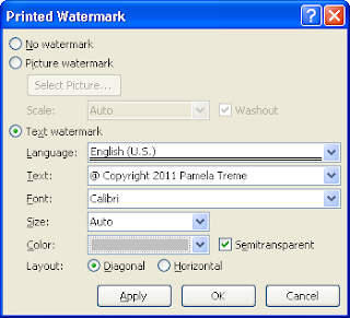
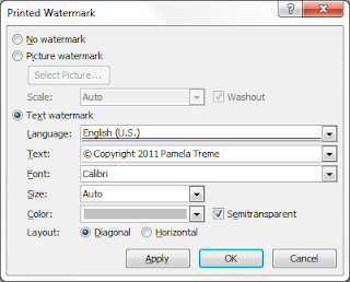
For Word 2007 or 2010: Select the Page Layout tab. Locate and select the Watermark button. A dialog appears. Click Custom Watermark. The dialog appears.


Corrected copyright symbol. What was I thinking?

3. Select Text watermark.
4. Add text in the Text field, and check that you have the same selections shown in the sample above, and then click OK. You might want to take a minute to look at the other available options.
5. Inspect your document to see the results. If you’re happy with the results, you can save your document, and then save it as a PDF for deployment.

I wouldn’t necessarily advise placing a watermark on every document you create. However, knowing about watermarking adds to the arsenal that you can use to protect your work.

Wednesday, May 11, 2011

Creating Visual Appeal

One of the layout options you have is number of columns. When you layout a document, Word assumes you want one column. However, there are times when you might want two or more columns. Think about some of the interesting magazine layouts you see with one column in the top half of a page supported by two columns in the lower half of the page. Variations in layout create visual appeal. Here’s a sample of this type of layout.


By default, Word assumes that you want one column for any document you create. Therefore, for these instructions, I’m assuming that you’ve accepted the default of one column for your entire document. Further, I’m going to assume that you want to switch to a two column layout for a small section and that you are mid-chapter. Therefore, you’re making a temporary layout change on the fly.

Switching from One Column to Two Columns
1. Place your cursor where you want the two column layout to start.
2. Insert a Continuous break.
For Word 2003, click Insert on the menu bar, and then select Break. The Break dialog appears. Under Sections break types, select Continuous, and then click OK.

For Word 2007 or 2010, select Breaks on the Page Layout tab. A drop-down menu appears. Under Sections Breaks, select Continuous, and then click OK.

3. Change the number of columns.
For Word 2003, click Format on the menu bar, and then select Columns. A drop-down menu appears. Select two-column.

For Word 2007 or 2010, select Columns on the Page Layout tab. A drop-down menu appears. Select Two.

4. Type your text.
5. Return to a one-column layout. Repeat steps one through three but select one column. Your layout returns to the default one-column layout.

As long as you add the Continuous section breaks before and after a section of text, you can change the layout for that text to two or more columns without affecting the remainder of your document.

For existing text, simply highlight the text (select it with your cursor), and then change the number of columns. Word adds the Continuous breaks before and after the text for you.

To see the Continuous breaks, click the Show/Hide button to reveal the hidden codes.

See the post Hidden Word Codes.

What you should be taking away from this post is that if you want to do something that deviates from the default layout of your document, just put the text between Continuous breaks and you can do just about anything to that text without affecting the remainder of your document.

Monday, May 9, 2011

Printing Manually...the Duplex Workaround

Printing manually refers to printing on both sides of a piece of paper. These instructions assume that you are using mirrored margins, and headers and footers so that you would have a need to print on both sides of a piece of paper. If you don't have a printer that has duplex printing capabilities, you need to understand how to print manually to get the desired results...a document that looks like a book.

1. Start the print process.
For Word 2003 or 2010, click File, and then Print.
For Word 2007, click the office button, and then Print.

2. Print the odd pages. The manual page print options are circled in the screen shots below.
For Word 2003 or 2007

For Word 2010

3. Click Odd pages option, and then click OK. The print prints on the front side of the paper.
4. After the odd pages print, flip the stack of pages over and reload them into your printer.
5. Click Even pages option, and then click OK. The printer prints on the back side of the paper and you have a duplexed document.

Be sure to practice on a small document--4 or 6 pages--so that you learn how to flip the pages in your printer. The direction you flip the pages depends on the design of the printer.

A number of other ways to complete this task are possible. However, I've found that simply printing odd pages, flipping, and then printing even pages has usually been the easist for me.

Wednesday, May 4, 2011

Printing Large Documents

After you’ve mastered layout and dealt with headers and footers, you need to think about what happens when you actually want to print your document. In an ideal world, you can send your document to a high speed duplex printer. A duplex printer prints on both sides of a piece of paper. Your document—with mirror margins and running headers and footers—prints out looking like a professionally produced book.

Most people don’t have access to a high speed duplex printer. However, you do have print options that allow you to still produce a professional looking book. Here are some of those options.

1. Print your document on one side of a piece of paper. Go to your local copy center and copy the document using the duplex features on the copier. Ask the clerk in the store to help you if you don’t know how to set up duplex printing. The clerk will understand exactly what you are trying to do.

2. Print your document in pieces. On your printer at home, print the odd pages (fronts) first, turn the printed pages over, and print the even pages (backs) on the backside of the piece of paper. This type of printing is referred to as manual printing. When you select this option, you should practice on a small document (about 6 pages), so that you can see how your printer handles the task.

3. Send your document to a print-on-demand (POD) service. Many copy centers offer this type of service. You need to check with them to see what the requirements are. Basically, you send them your Word document (usually an email attachment) and they print it from the electronic copy.

4. Submit your document to a full print-on-demand service like Lulu.com. This choice is a big time commitment. However, if you’re ready to sell your book a service like Lulu can provide invaluable assistance. Generally, PODs require that you send them a PDF, which they store. When they receive an order for your book, they print, bind, and mail one copy. If you’ve used Print Preview to confirm that your document will print correctly, you can order a copy of your book to see what it looks like.

Options 1 and 3 are pretty self-explanatory. As long as you’ve set up the layout and figured out your headers and footers so that they are working correctly, you’ll get the desired results.

Option4 requires that you enter into an agreement with a POD service. Be sure to read all of the details. You can buy lots of services or just a few services. However, it’s a buyer beware situation that you need to research before you start typing in your credit card number.

Option 2 requires some instructions. I’ve been doing some pretty long and complicated posts. So I’ll save the instructions for option 2 for my next post.

Monday, May 2, 2011

PDF to the Rescue

Many of the types of graphics you might want to use in a document fit the profile of a graphic that needs to be rotated so that it fits on a portrait oriented page. For example, a census sample, a certificate, or a chart. You already know how to rotate a census page or a certificate. Generally, you have these items already appearing as a graphic (.gif, .jpg, or .png). You can copy the item into a Paint canvas, rotate it, and then copy the graphic and place it in your document.

A chart can be a different story. Frequently, a chart is developed as a Word document, in an Excel spreadsheet, or a PowerPoint slide. The likely hood of using one of these programs increases if you use one of the many templates available on the Web. Even if you use a genealogy program to export your data to a chart, you generally don't get a chart that you can rotate easily. Frequently, you get a chart that is in Rich Text Format. You can save the files in other formats; however, none of them is a graphic format.

With any of these formats, if you try to do a screen print and then paste the screen print into Paint like I've suggested previously, you get only a portion of the screen print (unless you are working on a very large monitor). Here's a suggestion for handling the problem.

1. Produce your chart. It doesn't matter what program you use.
2. Convert the chart to a PDF.
If you're using 2007 or 2010 software, you have the option of simply saving the document as a PDF. If you're using Word 2003, you need to go out on the Web and download one of the free PDF creators. You can also buy a PDF progam that will give you a bit more in capabilities; however, the free ones work just fine. When you PDF the page, the PDF creator shrinks the chart to fit comfortably on the page.

3. Be sure to maximize the display of the PDF on your screen.
Click the square beside the X that you would use to close the PDF to get a full screen display.

4. Use the zoom percentage of the PDF to display all of the chart you've created.
Using the percentage is what allows you to capture the entire chart as a paste item that will work in Paint. You want the biggest display you can get while still being able to see the entire chart. For example, enter 90% as the zoom percentage.

5. Complete a screen print.
On a PC, you simply press the PrtSc button. On a laptop, you need to press an additional key (blue FN on my laptop), and then press the PrtSc button. A copy of your screen is placed on the clipboard.

6. Open Paint, and paste the screen print. (Press Ctrl + V).
7. Use the scroll bars to move your chart to the center of your screen.
8. Use the Select tool to draw a line around your chart.


Click to tool, and then click in one corner of your chart, hold down your mouse key, and drag your cursor across the chart to the other corner. Let go of your mouse key.

9. Copy the selected area. (Press Ctrl + C).
10. Open a new canvas. (Click File, New.)
A message asing if you want to save the current drawing appears. Answer Don't Save, and a new empty canvas appears.

11. Paste the selected area into the new canvas. (Press Ctrl + V.)
12. Rotate your graphic, copy it, and paste it into your document.

So now the question...Who's more exhaused? You? Me? Probably both of us. I know this all sounds like a lot. However, once you get used to bouncing into and out of Paint to deal with a graphic on the fly, the easier it becomes. Besides, just think how impressed all your friends will be when you show them how to handle this problem.