Showing posts with label Font Color. Show all posts

Thursday, June 28, 2012

Desperately Seeking Hidden Text...Part 2

If you plan to use hidden text all the time, you can make selections that cause all hidden text in a document to appear when you open the document. The setting is personal in that it works in your personal copy of Word. If readers of your document do not have the option turned on, they won't see the hidden text.


Selecting the Option in Word 2007/2010
  1. Open Word Options.
    --Word 2010: Click File, and then Options.
    --Word 2007: Click the Office Button, and then click the Word Options button.
    --Word 2003: Click Tools, and then Options. On the View tab, locate the Formatting marks group. 
  2. Click the Hidden text check box, and then click OK. Hidden text will appear automatically in any document you open. 

The Less Obvious Option--or--the Weasel move...
If you have text that you absolutely do not want anyone to read, here's an option. Select the text and change the font color to white (or whatever the background color is) so that the text simply can't be distinguished from the background.
  1. Highlight the text. 
  2. Open the Font dialog.
    --Word 2007/2010: Go to the Home tab, locate the Font group, click the drop-down arrow (dialog launcher) in the lower right of the group box.
    --Word 2003: Select Format, and then Font. 
  3. Click the drop-down arrow in the Font color field to display the color palette.
  4. Pick white as the color, and then click OK. 
If you pick text in the middle of a paragraph, the text will simply disappear but the space for the text will remain. For anyone who knows this trick, it's a hint to them to simply highlight the area, open the Font dialog and pick a color to display the text. So, if you decide to use this method, you might want to make sure you have the text on a line by itself or in an out of the way place like a footer or a header. 

I'll ponder for a while to see if I remember any more about using hidden text. Like so many things with Word, it's the little things that can matter at the oddest of moments. But, if you've played with the option, you have a better chance of remembering that it's there when you need it. 

Sunday, July 17, 2011

Frame Up Part Three…Adding Color

One of the things I breezed by in my last post was the instruction to pick a color.  If you click the drop-down arrow beside almost any field that is labeled Color or that is used to select a color, the same color dialog appears.

Click the graphic to see your options. Note that if you are using Word 2003, you will not have the Theme Colors options. Your final option, More Colors..., shows additional dialogs with more color options.

Standard Tab

The standard colors on this tab are web safe colors that will show well online. If you plan to convert your document to a PDF and post it on the web, you might want to consider using one of these colors so that you get expected results. As for matching colors, you're on your own.
  1. Click a color.
  2. Click the OK button. The dialog closes, and the color appears in the Color field.
  3. Click the OK button to save the changes.
Custom Tab

If picking colors is your thing, this dialog is for you. You can create exact shades by adjusting the Red, Green, and Blue entries.
  1. Click in an area that is closest to the color you want to define. The system adds a cross hair to mark the area you clicked, updates the color slide bar with shades of that color, and adds numbers in the Red, Green, and Blue fields to define the color.
  2. Use the color slide bar to adjust the color you are defining. Click the left-facing arrow and pull down or just click anywhere on the slider to move the arrow.
  3. Enter specific numbers in the Red, Green, or Blue fields to fine tune your color.
  4. Write down your color definition. You won't remember it later.
  5. Click OK to save your color selection. The dialog closes, and the color appears in the Color field.
  6. Click the OK button to save the changes.
You also have the option of changing the Color model. I normally don't do so; however, you might want to investigate this option.

Comments
In almost every instance when I have had to choose colors for a Microsoft product, the dialogs shown here are the dialogs I've used. Therefore, if you are interested in color, it's worth your time to learn to use the dialogs. You'll see and use them again and again.

Personal Note
I'm sorry I disappeared for the better part of the week. The man in my life had a health issue and we were dealing with it. I was fretting far too much to be able to post anything that was coherent. He's much better now...so am I!

Saturday, June 11, 2011

Modify Style...Formatting a Style

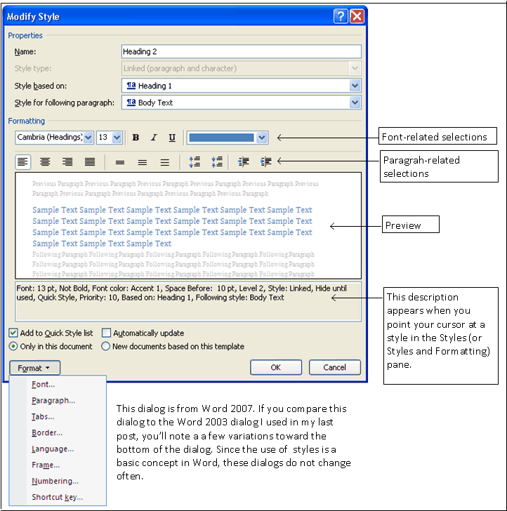
Click graphic to display, and then click Back button. 

This sample is the Modify Style dialog from Word 2007. You'll notice that this dialog is very similar to the dialog from Word 2003 from the previous post. All of the Modify Style dialogs are similar because setting up and using styles is a basic concept of Word. Word expects you to apply styles to every string of text you add to a document.

Formatting
The Formatting group in the middle of the dialog allows you to make font- and paragraph-related selections that apply each time you apply the style to text. In this post, we'll be talking about the font-related fields.

Font-Related Fields
Use these fields to pick a font, a font size, font attributes (bold, italic, underline), and color. As you make changes, check the Preview below to see how your changes will look.

Font
When selecting fonts for a long document try not to get too wild. Try to limit yourself to two fonts: one for headings and one for text.  As a general rule of thumb, Heading styles should be sans serif (no feet) while styles you would use in running text should be serif (with feet...similar to this font). Here's the theory. When you're reading dense text, the feet help you read faster because the feet help you group the letters easily into words.

Now all this advice goes out the window if you're designing styles for some sort of handout. You might want to use a third font for emphasis.

If you'd like more advice about design and layout, my favorite author is Robin Williams. She wrote (and has updated) the book: Non-Designer's Design Book. I like Williams' book because it offers suggestions that anyone can follow to produce more effective professional looking layouts.

Williams has very kindly placed some of her work in PDF format on the Web. She offers a free PDF download of what looks like an earlier version of her book. I didn't download it. If you decide to download it, the usual cautions apply. Remember to make sure that your virus software is up to date and that you have backups of your system.

Font Size
Font sizes are in points. One point is equal to 1/72 of an inch.

Text is usually 9, 10, or 11 points. If you know your audience is visually impaired, you might go larger...perhaps 12 points. If you plan to print the document, you need to consider font size because the larger the size, the more paper you'll use. I'm not kidding about eating up paper with font size.

Headings are usually 12 points and larger. We'll look at doing some additional things to headers that make them stand out in running text. So again, don't get too carried away with trying to make the font too large.

Font and font size is one instance where applying styles to text comes in handy. If you start out with 9 point Times New Roman and you want to change it to 11 point Garamond, you change the style and the change cascades throughout your document, changing each place where the style was applied. When you change a style, you need to recheck page breaks if you've added any (Ctrl + Enter). The same holds true for heading styles, which you are more likely to change after you've seen several pages of your document. If you've applied styles to each text string in your document, you always have the option of making changes...or changing it back if you decide you don't like the change you made.

Attributes and Color
Attributes (bold, italic, and underline) and color are pretty self explanatory.

The color drop-down has a More Colors option. Click it to display the color definition tabs. The colors on the Standard tab are Web-safe colors (important on Web pages). The Custom tab has fields that allows you to enter red, green, and blue color formulas...numbers that when combined define a color for your text.

Again, you have to consider if you are going to a printed document. If yes, you may want to stick with black and gray.

Color is another place where having applied styles matters. When I work on a newsletter, I add all the color I want to the headers, text, and so forth. I PDF the in full living color version for posting on the Web. Then, I save a copy of the newsletter, and alter the styles to black, gray, and white text on a black or gray background. This version is the print version.

As you can see, applying styles gives you options...lots of interesting options.

In my next post...
I'll pick up with the paragraph-related selections.