Wednesday, June 29, 2011

Achy Breaky Page Breakin'

When we last left our heroine, she was trying to figure out what she needs to say about page breaking...

The option in question is Page break before. When you select this option for a style and you apply the style to text, Word automatically moves the text to the top of the next page. For the most part, you are going to select Page break before when you are designing heading styles. Using automatic page breaking:

  • Increases your work efficiency. You don't have to insert manual page breaks (Ctrl + Enter). Word does the task for you. Manual page breaks can become a problem when you add or remove text before the page break. You have to look for them and deal with them when your pagination goes awry. 
  • Decreases the size of your document. In long documents, manual page breaks add an empty line of text, which artificially bloats your document. An automatic page break adds almost nothing. 
  • Ensures that the spacing at the top of the page is correct. When you insert a manual page break, you need to check the spacing in Print Preview to confirm that it isn't too much or too little, and complete a local change to correct it if it isn't right. Using the automatic page breaking eliminates most instances when you need to make a local adjustment. 

If you looked at a template that I designed, you would probably find the following selections.

Heading 1
Page break before is not selected because I usually apply Heading 1 to chapter titles. The page break for the new chapter occurs when I insert a break, usually an odd page break in large documents.
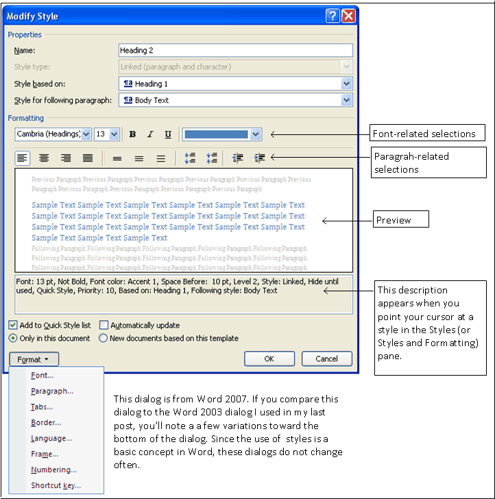
Heading 2
Page break before is selected because I'm assuming that a Heading 2 introduces a major section that includes several pages and that I'm going to want to have it start on a new page. For example, if I'm working in a chapter where I am discussing several types of records (Census, Land, Wills) for a family, I would want each of my categories of records to start on a new page. Starting on a new page tells your reader that you are addressing a different topic.

Heading 3
Page break before may or may not be selected. It depends on whether I plan on using a Heading 4. If yes, then I probably will select the option because I'm assuming that a Heading 3 topic is major enough that I will want it to start on a new page. If no, then I probably will not select Page break before.

Troubleshooting Table of Contents
Remember that heading styles are the basis for an electronic table of contents. Regardless of how you apply a page break, it should not affect your table of contents. The one exception that I can think of if when a heading style is applied to a manual page break. When that happens, a blank line appears in your electronic table of contents. Selecting Page break before for your headings means you won't be inserting manual page breaks and you reduce the possibility of having unexpected results in your table of contents.

Suppressing the Page Break
Regardless of how well you plan, you are always going to have a few page breaks that appear automatically in places you'd rather not have them appear. When this occurs, you can make a local change to fix that one instance.

Remember the definitions:

  • Global changes occur when you right click a style on the Styles (or Styles and Formatting) pane, and then select Modify. You make a change that affects every instance where the style is applied. 
  • Local changes occur when right-click in text, select Paragraph from a pop-up menu, and make a change that affects only the current paragraph. All other instances where the style is applied are unaffected. 

Future Posts
I still have lots to say about page breaking before I get back to making selections for a style. At least I have a start on a big topic.

Monday, June 27, 2011

No Text Stranded Before Its Time

Word 2007/2010 Line and Page Breaks Tab

This dialog allows you to deal with stranded words, headings, titles, paragraphs, and any other text elements you can think of. 

Reminder...you can use several methods to display this exact dialog. The difference is always whether you are making a global change (via a style) or a local change (via a menu or picking the Paragraph option from a pop-up menu when you right-click in text). 

Pagination: Widow/Orphan Protection (no stranded words)
As you are typing along and you get to the end of the page, you might find yourself with two or three words (or worse, one word) of a paragraph getting stranded at the top of the next page. Most style guides will tell you to move the last line on the previous page to the top of the following page so that you end up with two lines at the top of the following page.

When you click this option, Word does the task for you automatically. Widow and orphan protection is selected for most styles by default and there's no reason I can think of that I would not simply accept the default.

Pagination: Keep with Next (no stranded headings)
As you are typing along and you get to the end of the page, you might find yourself with a heading or a title appearing as the last line on the page. You don't need a style guide to tell you that you want the title at the top of the next page.

You can insert a page break before the title. Or, you can select this option for each style that is a heading or title. With the option selected, Word will move the heading/title automatically to the top of the next page when you press Enter. The advantage to using this option over simply inserting a page break is that if you add or remove text before this section, Word automatically adjusts and keeps the title with the paragraph, regardless of what you add or remove.

In addition, if you accept the default widow/orphan protection, you almost never have to deal with pagination issues because Word takes care of them for you.

Pagination: Keep Lines Together (no stranded lines in a paragraph)
As you are typing along and you get to the end of the page, you might find yourself with a paragraph with lines that should be kept together and moved to the top of the following page. I have found this option useful only on rare occasions. One time that does leap to mind is when I'm typing a copyright statement. The statement should always be one paragraph that stays together no matter what else is happening in the document.

Use caution when applying this option. Apply it too often and for too many styles, and you can paralyze and confuse Word so that you get some unexpected (unpleasant) results.


Pagination: Page break before 
I'm going to save this option for my next post. I'm dragging my feet on explaining page breaking while I think. The method you choose is dependent on where you are and what you are trying to accomplish. This option is one of those methods. I'm trying to make sure I remember every option and explain each so that you understand when to use a given method. 

Friday, June 24, 2011

Format-->Paragraph

To display the Paragraph dialog, display the Styles (or Styles and Formatting) pane, right click a style, select Modify, and then click Format and then Paragraph.


General: Alignment
Pick one from the drop-down list.
  • Left: This alignment is the most used because we read from left to right. Your right margin has an uneven look. 
  • Centered: This alignment is frequently used to align graphics in the center of a page.
  • Right: This alignment is hand when you want text to feed from the right margin left. 
  • Justified: This alignment causes text to have an even right margin. When you use this alignment, the computer adds spacing between words in a line. Visually, your document looks perfect but it can be hard to read because of the different spacing between words.
General: Outline level
I've never used this particular field when designing a document. If you Google, your version of Word plus Outline level (Word 2010 Outline level), you'll find lots of information on the topic.

Indention: Left/Right
The Left and Right fields allow you to control and indent from the left and right margin. The increment is in inches.

A use example would be a quote or block quote style. As a general statement, when you have a quotation that is more than five typed lines long, it should be indent .5 inches from each margin to set it off from the remainder of the text. I've used a quote style on as few as three typed lines because I've wanted to highlight the quote.

You have built in styles for quotes that will include the word quote in the name (for example, Quote, Block Quote, Intense Quote). The indents for the quote are controlled from these two fields. If you decide you want to increase the customary .5 inch indent, these fields are where you make that alteration. Just remember that when you make the change, the change applies to every place where you use or used the style.

Indention: Indent Special/By
  • First line
    If you like to indent the first line of a paragraph to alert your reader to the new paragraph, select First line from the drop-down list, and in the By field enter the amount you want the first letter of the first line to indent. The default is .5 inches. 
  • Hanging
    Hanging indents are used with bullets like the ones you see here. I've rarely seen bullets in a genealogical-related document. In addition, you have built-in bullets that take care of this formatting for you. However, you should still know where the hanging indent is controlled in case something goes wrong with one you are using.
  • Mirror indents
    When you click this option, Left/Right turns into Inside/Outside, which refers to the gutter in a mirrored margin document...I can just hear the groaning...where is she now! These are the types of margins that allow you to have page numbering appear like it does in the printed book. Having the option associated with a style allows you to override the general setting for the entire document that you set up when you completed Page Setup. When you completed the Page Setup, you added a gutter (the distance from the inside and outside margins to the edge of the page). The gutter has to be large enough to accommodate binding. It's much easier to control this option from the Page Setup. 
Spacing: Before/After
These fields control the spacing before and after a paragraph. When you build the before/after space into a style, the spacing is applied whenever you apply the style to text. I've written about these fields before in Stop Document Bloat. At the end of a paragraph, you should only have to press Enter once.

Also of note where this field is concerned is that I like to use multiples of three (3, 6, 9, 12...). When you press enter and one field has 6 points after and the next style has 12 points before, the spacing between the elements is 12 points. If you want more space, you can do a global change (change the style) or a local change (right click in the text, select Paragraph, and make a change that applies only to the currently selected paragraph).

Spacing: Line Spacing
For the most part I use single spacing. Of note, if you are using Word 2007 or 2010, you'll find that body text styles are set to Multiple 1.15. So your spacing between lines is .15 inches more than the normal single spacing. The additional .15 is intended to make reading easier. I find that all it does is eat up space...and paper. I reset my styles to Single.

Spacing: Don't add space between paragraphs of the same style
I don't use this setting. I'll have to do some research to see if I want to use this option.

Preview
As you make changes, they are reflected in the Preview field. You can sometimes spot a problem by checking the preview.

Reminders
  • Global changes are the result of changing a style and applying that style to many pieces of text.
  • Global changes are always made via the Modify Style dialog. 
  • Local changes are the result of selecting text (for example, a paragraph or a title), right-clicking in the selected text to display a pop-up menu, and then selecting Paragraph to display the Paragraph dialog. 
  • Local changes are always made via the Paragraph dialog.
Now the confusion, you can display the Paragraph dialog in several ways. You need to remember that to make a global change, you always right-click a style in the Styles (Styles and Formatting) pane, and then select Modify. As you can see, getting to the right Paragraph dialog is important.

Next Post
The next post is going to be on the Line and Page Breaks tab. I'm going to attempt to explain page breaking because one of the major page break options in on this page. There are a number of ways to enter a page break in a Word document. They each have their specific use and you need to know about each one if you are going to produce large documents.

Monday, June 20, 2011

Format --> Font

My horoscope says that I'm going to be very busy for the next six weeks. It seems to me that it's already started! Now it's back to posting...and unfortunately, this isn't going to be an exciting post. It's more about fonts. Boring or no, you need to know about this screen.

To display the Font dialog, display the Styles (or Styles and Formatting) pane, right click on a style, select Modify, and then click Format and then Font.

Word 2010 Dialog


You've seen lots of these fields on the Modify Style dialog. They repeat on the Font page to allow you to bypass them on the Modify Style page and use them on this page while setting up a style with Effects.

Effects
Superscript causes text to appear above the normal line of type.
Subscript causes text to appear below the normal line of type.
Small caps causes text to appear in all uppercase letters but slightly smaller than normal upper case.
All caps cause text to appear in all uppercase letters.

This dialog isn't very exciting in Word 2007 or 2010. The dialog is much more fun in Word 2003. If you're a Word 2003 user, be sure to click each of the options and look at the change in the Preview. For example, you can create a text that looks as if it is embossed. The methods for making similar changes in Word 2007 or 2010 are different. We'll go over it in another post.

When you see the same fields and dialogs with similar names, it's easy to become confused. The way to remember what you are actually doing is to remember how you displayed the dialog.

If you access a dialog by right clicking on a style and selecting Modify, you are making a global change. The global changes you made appear each time you apply the style to text.

If you access a dialog by making selections from the main menu or ribbon, you are making a local change. The local changes you made appear only in selected text.

For the next post, I'm going to skip forward to Format-->Paragraph.

Wednesday, June 15, 2011

Modify Style...Options at the bottom of the dialog

Depending on the version of Word you're using, you can have different options at the bottom of the dialog. I would say off hand that you should just accept the default selections. However, I do think you should understand what you are accepting. Here's a run down of what I know/think about each of the options.

Add to template
Click this option when you are creating or altering a style that is associated with a template. As I've said in the past, every document in Word starts with a copy of a template. It may be the Normal.dot template (Notice the .dot or .dotx extension) but it is a template none the less. Later, we are going to create a template. Right now you just need to know that the check box is here and that you can add a style to a template on the fly using this box.

Another option is to create a document (.doc or .docx) and the save your document as a template. If you use this method, you do your page layout, alter or create all of your styles, and then save the document as a template. Word adds it to your template gallary (when you click File, New, you arrive at the gallary) and you can pick it from the gallary to create documents. When you use this method, you don't use this Add to template check box at all.

Automatically update
In my opinion, checking Automatically update is akin to placing a voodoo curse...complete with snakes and dolls...on any document in which you use the style. My recommendation is to never select this option. If you have this option checked...and you forget about it...and you make one small change (for example, change the paragrah spacing to squeeze a paragraph onto the bottom of a page), Word does exactly what it's suppose to do. It changes every instance of the style; that is, every place you've applied the style. Now you can change the style back but you could also not check the option and avoid the pain.

Add to Quick Style list
This option is checked by default. You can leave it checked. It simply makes the style available in your current document.

Only in this document
This option is also checked by default. You can leave it checked. Most likely you'll use the Modify Style to do just what the style dialog says...modify a style.

New documents based on this template
This option is unchecked. Again, the assumption is that you are altering an existing style in an existing template.

Next Post
We'll be clicking Format-->Font to see what more we can do with fonts...there's still lots we can do with fonts other than what you've seen in the Formatting group on the Modify Style.

Tuesday, June 14, 2011

Modify Style...Picking Some Paragraph-Related Selections

Sorry for the break. All of the pieces came together for the Florida State Genealogical Society newsletter (I'm the editor), and I needed to put it to bed. I just sent the print version to the printer and so it's back to talking about modifying styles.

In the last post, we were talking about the formatting line on the Modify Style dialog.
  • As a reminder, changes you make on the Modify Style dialog are global and work when you apply the style to text.
  • As a reminder, changes you make on any other dialog or menu are local and work only for selected text; that is, one instance.
The line immediately below the formatting options are for paragraph formatting. You can make paragraph-related selections on this part of the dialog. Or, you can make the same changes on the Paragraph option dialog that appears when you click the Format button on the Modify Style.

Alignment
The first set of icons are for text alignment: Left, Center, Right, and Justified. For most styles (headers and body text), you're going to pick left alignment; the text feeds left to right. The center alignment is frequently used for graphics; therefore, if you were creating a style for your graphics, you might want to pick the center alignment. If you do happen to type text, the text centers itself between the right and left margin. The right alignment is frequently used for text in a header or footer; the text feeds right to left. The right alignment is also used to align columns of numbers; for example, the columns in an invoice. The justified alignment adjusts the spacing between words so that the right and left margins are perfect. While this might contribute to an aesthetic value for your document, justification makes text difficult to read because the spacing is no longer proportional and predictable between words.

Line Spacing
The second set of icons are for line spacing: Single Spacing, 1.5 Spacing, and Double Spacing. For the most part I use single spacing. Of note, if you are using Word 2007 or 2010, you'll find that if you look on the Paragraph dialog (click Format, and then Paragraph) that body text styles are set to Multiple 1.15. So your spacing between lines is .15 inches more than the normal single spacing.

Paragraph Spacing
The third set of icons are also for spacing; however, these icons can be used to increase or decrease the space between paragraphs. Adding space before and after paragraphs creates the white space you need to create a visual break between paragraphs. Many users just hit return twice and leave an empty line, which contributes to document bloat...something I've already talked about.

Indent from Left Margin
The fourth set of icons are used to create an indent from the left margin. Each time you click one of the icons, the left margin for the indent moves one half inch by default.

Preview and Description
Each change you make appears in the preview pane below. In addition, the description of the style appears below the Preview pane. This description changes as you make changes and this description appears when you point your cursor at a style in the Styles (or Styles and Formatting) pane when you are applying styles to text.

Next Post
In my next post, I'll talk about the options appearing at the bottom of the Modify Style dialog, and then we'll be moving to the options that appear when you click the Format button. Each of the Format options displays an additional dialog...some more interesting and useful than others.

In the meantime...for your amusement...Google updated Blogger and introduced...horrors!...new buttons that I'm having to learn to deal with. The interesting thing is that Google has picked icons that are a lot like the ones I use in MS Word and several other programs. So I can use my Word experience to make educated guesses on how to use the new toy that Google has given me.

Saturday, June 11, 2011

Modify Style...Formatting a Style

Click graphic to display, and then click Back button. 

This sample is the Modify Style dialog from Word 2007. You'll notice that this dialog is very similar to the dialog from Word 2003 from the previous post. All of the Modify Style dialogs are similar because setting up and using styles is a basic concept of Word. Word expects you to apply styles to every string of text you add to a document.

Formatting
The Formatting group in the middle of the dialog allows you to make font- and paragraph-related selections that apply each time you apply the style to text. In this post, we'll be talking about the font-related fields.

Font-Related Fields
Use these fields to pick a font, a font size, font attributes (bold, italic, underline), and color. As you make changes, check the Preview below to see how your changes will look.

Font
When selecting fonts for a long document try not to get too wild. Try to limit yourself to two fonts: one for headings and one for text.  As a general rule of thumb, Heading styles should be sans serif (no feet) while styles you would use in running text should be serif (with feet...similar to this font). Here's the theory. When you're reading dense text, the feet help you read faster because the feet help you group the letters easily into words.

Now all this advice goes out the window if you're designing styles for some sort of handout. You might want to use a third font for emphasis.

If you'd like more advice about design and layout, my favorite author is Robin Williams. She wrote (and has updated) the book: Non-Designer's Design Book. I like Williams' book because it offers suggestions that anyone can follow to produce more effective professional looking layouts.

Williams has very kindly placed some of her work in PDF format on the Web. She offers a free PDF download of what looks like an earlier version of her book. I didn't download it. If you decide to download it, the usual cautions apply. Remember to make sure that your virus software is up to date and that you have backups of your system.

Font Size
Font sizes are in points. One point is equal to 1/72 of an inch.

Text is usually 9, 10, or 11 points. If you know your audience is visually impaired, you might go larger...perhaps 12 points. If you plan to print the document, you need to consider font size because the larger the size, the more paper you'll use. I'm not kidding about eating up paper with font size.

Headings are usually 12 points and larger. We'll look at doing some additional things to headers that make them stand out in running text. So again, don't get too carried away with trying to make the font too large.

Font and font size is one instance where applying styles to text comes in handy. If you start out with 9 point Times New Roman and you want to change it to 11 point Garamond, you change the style and the change cascades throughout your document, changing each place where the style was applied. When you change a style, you need to recheck page breaks if you've added any (Ctrl + Enter). The same holds true for heading styles, which you are more likely to change after you've seen several pages of your document. If you've applied styles to each text string in your document, you always have the option of making changes...or changing it back if you decide you don't like the change you made.

Attributes and Color
Attributes (bold, italic, and underline) and color are pretty self explanatory.

The color drop-down has a More Colors option. Click it to display the color definition tabs. The colors on the Standard tab are Web-safe colors (important on Web pages). The Custom tab has fields that allows you to enter red, green, and blue color formulas...numbers that when combined define a color for your text.

Again, you have to consider if you are going to a printed document. If yes, you may want to stick with black and gray.

Color is another place where having applied styles matters. When I work on a newsletter, I add all the color I want to the headers, text, and so forth. I PDF the in full living color version for posting on the Web. Then, I save a copy of the newsletter, and alter the styles to black, gray, and white text on a black or gray background. This version is the print version.

As you can see, applying styles gives you options...lots of interesting options.

In my next post...
I'll pick up with the paragraph-related selections.

Wednesday, June 8, 2011

Modify Style Dialog...for global changes

When you display the Modify Style dialog, it looks like you’re just controlling font-related information. You might ask, “So what’s the big deal?” The big deal is the Format button, which gives you access to all sorts of other dialogs that let you control every aspect of a given style. The picture below is just a preview of posts to come in that we will be going through each of the Format options…we have a long way to go.


We’ll start today with Properties on the Modify Style dialog.


Name
The name of the style. If you try to create a new style and you get an error message saying the name already exist, display all styles, find the style, and alter it to make it your own.

Style type
The type of style.  Most likely, you’ll be using paragraph and character styles.
  • A paragraph style applies to an entire paragraph.
  • A character style applies only to selected text.
When you display the Styles (or Styles and Formatting) pane, Word gives you a hint on the style type by adding a symbol to the right of the style name. 
  • A paragraph mark (¶) is the symbol for for a paragraph style.
  • An a (underlined, lower cased) is the symbol for a character style.
When you add a new style, you need to understand the difference between the types of styles so that you pick the right type for the style you are adding.


Style based on
The style from which the current style inherits its characteristics. For example, the font for your style is defaulting to 12 points, red, and italic. Your new style is doing so because it is inheriting those characteristics from the based on style.

The based on style is just a starting point. The changes you make for this style make it unique in your list of style. However, if you make changes to the based on style, the current style can change because it inherits change made to the based on style.

When you create a new style, you might want to pick (no style) from the drop-down list. You have to define every aspect of the style; however, it will not change when you make other changes to styles.

Frequently, the base style is Normal. Normal is the lowest level body text style and the default style when you open a new Word document. I frequently change these based on styles because you can make a change to the Normal style that cascades through every style in the pane when you meant to make one small change for one style.

This effect is referred to as cascading…which should make you think of a cascading style sheet...yep, you just got high tech...when you understand how the style sheets in Word inherit, you understand cascading. And cascading is cascading is cascading wherever you see or use it.


Style for following paragraph
This field will save you lots and lots of time and clicking. When you are typing along and you press the Enter key, the style that is in this field is the style that Word applies to your next paragraph.

Here’s how you can use that piece of information. In the Styles (or Styles and Formatting) pane, right-click a Heading style, and then click Modify. The Modify Style dialog appears. If you haven’t altered anything, the paragraph style will be Normal. Click the drop-down arrow. You can make the following paragraph style anything you want it to be. When I set up a book template, one of the first things I do is change all of the Normal paragraph style to Body Text. When I apply a Heading style and I press Enter, the next style that appears is Body Text. I don’t have to pick anything. I can just keep typing because I’ve told Word to always give me a Body Text style when I press Enter after a Heading style.

Next Post
We’ll tackle Formatting next.

Monday, June 6, 2011

Global Changes vs. Local Changes

This post is an exercise that shows you the difference between global changes (changing a style) and local changes (changing selected text). 
Copy Text
Copy and paste the following paragraphs into a blank Word document, and then save the document with the name Styles. I'm simply trying to give you some text to work with and it doesn't matter what the text says.
  1. Highlight the text below between the following marks *****. 
  2. Hold down the Ctrl key and type c
  3. Open a Word document.
  4. Hold down the Ctrl key and type v. The text appears in your document.
  5. Save your document under the name Styles.
******
If an Irish immigrant’s dreams include leading the hard, humble life of a farmer, then William C. McKee’s life is a roaring success. William starts life in Ireland. His birth is sometime in 1812. He marries in his early twenties to Susana (or Susannah) Gilmore—probably in 1834. William and Susana have two children in Ireland. Margaret is born in January of 1835, and the Mary Jane is born in Port Norris, County Armagh, Ireland on 11 May 1837. Shortly after Mary Jane’s birth, the family grabs toddler Margaret’s hand, bundles up Mary Jane, and sets sail for America.
The family lives in New York City for a few years. The birth of Sarah—their third child—places the family in New York City as late as 1841. While in New York, William and Susana appear to lose their oldest child Margaret. Next, a land patent places the William McKee family on their Randolph County, Illinois farm by 1842.
While living on the farm, William and Susana have three more children, including William—their only son. In the course of life unfolding on the family farm in Illinois, William and Susana experience a joy that only parents can know. They watch their children grow and they give their older daughters away to happy, prosperous marriages.
As the life of William McKee begins to fade, he has only his wife, son, and youngest daughter at home. William appears with his family on the 1870 census but is gone by the 1880 census. The logical assumption is that he dies. William is buried in the Union Presbyterian Cemetery in Randolph County.
When contrasted with the sometimes dramatic and often loss-filled lives of his siblings, William’s life seems to be one of tranquility and modest prosperity. In spite of the turbulent times in which he lives, he appears to live out a life that must have been close to his immigrant dreams. 
******
Apply the Body Text style to all of the text.
  1. Display all style (see the post A Style for Every Season in you need help).
  2. Click anywhere in your document, and select all text in your document (Ctrl + A).
  3. Select Body Text from the style list. The Body Text style is applied to all text in your document.
Change the font for the style (a global change).
  1. Right click the Body Text style in the style list. A pop up menu appears. 
  2. Select Modify. The Modify Style dialog appears.
  3. Select a new font from the font field, and then click OK.
You’ve just made a global change; that is, you changed the font for every instance where the Body Text style is applied. You can also make a local change.
Change the font and color for one paragraph (a local change).
  1. Triple click the last paragraph to select the text, or just highlight the text to select it.
  2. Display the Font dialog box. In Word 2003, select Format, and then Font from the menu. In Word 2007/2010, click the Home tab, and then click the arrow in the lower right of the group box.
  3. Pick a new font in the Font field, pick a color in the Color field, and then click OK. The font and color of the text of only the selected paragraph change.
Notes: You can make the same local changes using the buttons and fields above your document. To remove the changes, select the paragraph again, hold down the Ctrl key, and press the spacebar once and then type the letter q. Your text is returned to the Body Text style.
Grrrrr...I'm trying to beat the clock...Google is doing maintenance and I can't upload images. These instructions are pretty easy so I'm going to post them without images. If you get lost, post a comment and I'll post the images or answer questions.
The big thing I want from this post is for you to see what happens when you make a global change or a local change. Having a clear understanding of how the changes are made is important for later discussions.

Wednesday, June 1, 2011

Laying the Ground Work for Changing Styles

As a reminder, when you want to change the way text looks (a paragraph), you simply click in the paragraph, display the style list, and pick a style. The look of the text changes.

As a reminder, all of the information about a paragraph style resides in the paragraph mark that is hidden at the end of the paragraph.

As a reminder, you click the Show/Hide paragraph button to show/hide the hidden paragraph marks.

As a reminder, you use styles to produce a consistent, professional looking document. In addition, if you need to make changes (for example you need to change the font), you change the style and Word updates every instance where the style is applied.

As a reminder, I’ve covered many of the styles in the All list. Please feel free to post questions if you need any additional info on a particular style or a style I haven’t talked about.

As a reminder, the skills that you learn in Word are transferable to other Microsoft programs. For example, Excel and PowerPoint use styles. So learning to use them in Word means you know how to use them in other programs.

Altering Styles
All of the buttons and menu selections you see on menus or ribbons are just small pieces from the Modify Style dialog. Knowing that piece of information is important, because there are times when you are going to want to use the buttons and individual menu/ribbon selections to make changes. There are other times when you will want to change the style. Here’s a rough guide to picking a method when making changes. The following assumes you have a document with styles applied to the text.
  • If you want to change a style, you display the Style or Styles and Formatting pane, and then right click the style you want to change.  A pop-up appears; pick Modify. The Modify Style dialog appears. The basic font information appears on the dialog.
  • If you want to change one instance of a style (a paragraph), you pick from the menu or ribbon. For example, if you want to change the space before and after a paragraph to nudge something onto a page, you would display the Paragraph dialog to make the change.
None of this is going to make immediate sense. I keep feeling like I should do a You-Tube to show it. However, I think if you bear with me, I do this is small enough doses that you’ll understand what it going on with styles.