I just completed a radio interview with Drew Smith for FGS Radio. We discussed staying in touch with society members, gaining new members, and retaining longtime members. Having the discussion was fun...a bit nerve wracking...I had no idea what questions Drew would ask...a completely cold interview. I think I stumbled only once. On the plus side, I probably made a suggestion that will cause a change in my local society's website; that is, to add links to members blogs on the society website. Anyway, if you want to hear the interview, visit the FGS website at:
http://www.blogtalkradio.com/mysociety/2012/03/31/high-touch-keeping-connected-to-your-society-members
Saturday, March 31, 2012


Thursday, March 29, 2012
Much Ado About Graphic Software...Part 5
I happen to be the editor of the Florida State Genealogical Society newsletter. One of the joys of producing an electronic newsletter is that you can add color without affecting costs; i.e., no ink + no paper = no money. Locating vivid clip art that is exactly what you need to dress up a page isn't hard. However, finding clip art that is the exact color you need might present more of a challenge.

View and Zoom
To work with a piece of clip art--for example, change colors, you need to be able to see detail. To assist you, Paint includes Zoom in, Zoom out, and 100% buttons.- Click Zoom in (repeatedly) to make the clip art larger.
- Click Zoom out (repeatedly) to make the clip art smaller.
- Click 100% to restore clip art to its original size.
- Do not confuse zooming with re-sizing.
--Zooming doesn't affect the actual size of the drawing.
--Re-sizing affects the actual size of the drawing...a task we'll tackle on another day.
If you're using an earlier version of Paint, you'll find the zoom options on the View menu. I usually select View, Zoom, Large to blow up the piece of clip art. For more control, you can also select percentages to enlarge the display.
In addition, the tool bar includes a magnifying glass that you can also use to enlarge clip art. I tend to use the menus to complete these tasks; however, you might find this tool useful.

Since you're going to need a piece of clip art, I suggest that you download the same piece I'll be working with so that what I'm saying has meaning to you.
Get Clip Art
- Click here to go a page with the pen and ink clip art.
- Locate the clip you've seen here.
- Click the Download button to download the piece of clip art.
- Give the clip art piece a name you'll recognize.
- Open Paint and then open the piece of clip art.
- Play with the zoom tools.
Next Post
We'll start changing colors in graphics.
P.S. As an aside, when you get text that you cannot read--for example, in a will, sometimes if you scan the document, save it as a .jpg, and open it in Paint, you can use the zoom to make it larger and decipher the text. The better the scan, the better chance you have of being able to read the text.
Wednesday, March 28, 2012
Table It!...Part 17...Text Direction

Merge Cells
Frequently, when you change text direction, you merge cells first. Remember the original census table? To get the sidebar with the rotated text, I first had to merge cells in the first column.
- Open a Word document and insert a table with four columns and four rows.
- Select the cells in the first column, and then right-click in the selected area. Word assumes you are going to merge cells and replaces Split Cells...with Merge Cells on the pop-up menu.
- Click Merge Cells and Word converts the selected cells into one cell.

Note: Also, you can highlight merged cells and
split them using the Split Cells... option.
split them using the Split Cells... option.
Change Text Direction
- Click in the merged cell and type the text you want to rotate. The spacing won't be what you want it to be; however, we'll fix any problems later. For example, type: 1850 Census Entries for McKee in Randolph Co., Illinois
- Right-click in the merged cell to display the pop-up menu.
- Click Text Direction to display the Text Direction - Table Cell dialog.
- Look at the option buttons and the Preview to the right.
- Select a direction option.

- Select the cells that should be shaded gray, and then right click to display the pop-up menu.
- Select Borders and Shading... to display the dialog and add shading.
- Use the buttons on the ruler to resize the columns.

Next Post
I'm going to continue working my way through all of the commands. So stay tuned for more in my next post.
Monday, March 26, 2012
Table It!...Part 16...Cell Alignment

Word 2003: Use the pop-up menu to select cell alignment.
Word 2007/2010: Use the pop-up menu or the alignment buttons in the Alignment group on the Layout tab of the Table Tools menu to select cell alignment.

- Flush Left: Buttons on the left are flush left (top, middle, or bottom).
- Flush Centered: Buttons in the middle are flush center (top, middle, or bottom).
- Flush Right: Buttons on the right are flush right (top, middle, or bottom).
Changing Alignment
- Select part or all of a table (a cell, a few cells, a row, a few rows, or the entire table).
- Click a button with a different alignment.
By default, table alignment is flush left top. You can see that in the graphic above. Do you want to accept this default? Sometimes yes; sometimes no. Your selection depends on your table and what understanding you are trying to convey; for example, a flush right alignment is frequently used for a column that presents numerical amounts like money.
Heading Row(s)
The first row (or two or three rows) of your table are considered heading rows. They explain what information is contained in the columns that make up the table. As a general rule of thumb, I use an alignment that causes the text to be flush left bottom or flush centered bottom. The bottom alignment is a visual cue to my reader that this text is different. When I add bold and a gray fill (like you did in the sample), you tell your reader that the text in these cells are the key to the table.
Sub-Heading Row(s)
Sub-headings appear in the middle of the table visually dividing the table. Generally, I use a flush left alignment and then add bold and a fill color so that readers can easily see the visual break.
Table Entries
The data entries that I make in tables are usually flush left top (the default).
Getting Creative
I've made suggestions in this post for creating a basic business table. However, you should experiment with using alignment for a more decorative effect.
Thursday, March 22, 2012
Table It!...Part 15...Menus
Word 2007/2010

Right-click in a table to display this pop-up menu.

Click in a cell, and then click the Layout tab on the Table Tools tab to see the menu above. There's a second tab (Design) that we'll look at later. Note that Table Tools appears only when your cursor is in a table (context sensitive display). Click the graphic to see a larger display, and then press the Esc key to return to this post.
Word 2003
Right-click in a table to display this pop-up menu.

Select Table to see this drop-down menu.
Pop-Up Menu
Regardless of the version of Word you're using, you can that some of the more commonly performed tasks--for example, aligning text in a cell (Cell Alignment)--is on the pop-up menu. A particular option might appear in other places in Word but it also appears on the pop-up menu so that you can use the option on the fly.
I'm not going to do more today than show you these menus. You should look at them to familiarize yourself with what is on these menus. In upcoming posts, we'll go through each of the options on the menus.
Wednesday, March 21, 2012
Table It!...Part 14...Cell Formatting

The Cell tab on the Table Properties dialog is the last tab that we'll be looking at for properties. Here's a run down.
- Size/Preferred width: You can set column widths. I prefer to do this using the ruler because you can see the table when you start changing column widths.
- Vertical alignment: You can select an alignment for cell text flush to the top or bottom or centered. Word includes another option on a pop-up menu that is easier to use for setting alignments.
- Options button/Cell margins: Click the button to display a Cell Options dialog. The dialog should look familiar. It's similar to the Table Options dialog that we looked at in part 12 when we looked at cell padding. This one is a bit confusing...bear with me.
- If you use the Table Options dialog to set cell padding, Word applies the setting to the whole table.
- If you select the entire table and then use the Cell Options dialog to set cell padding, Word applies the settings to the whole table. If you're using Word 2003, use this method to set cell padding for tables.
- If you select one or more cells (for example a column or a row) and then use the Cell Options dialog to set cell padding, Word applies the settings to the selected cells only. You may find that you can use this option to call extra attention to an area of a table without using anything more.
- Options button/Options: Click the button to display a Cell Options dialog.
- Wrap text: Leave this option selected so that text will wrap automatically within each cell.
- Fit text: Select this option when you want the system to force everything you type into one line. Word will alter the font size to accomplish the tasks. I've never found a use for this option; however, you should play with it and see how you feel about it. I can see where you might want to use the option in a title row.
We'll be looking at the pop-up menu and the main menu (ribbon) options. A few options you've seen on properties tab also appear on the pop-up or the main menu and are easier to use from those locations. So, until the next post, I hope you're having fun with tables.
Friday, March 16, 2012
Much Ado About Graphic Software...Part 4
When you save a graphic in Paint, you have a number of formatting options. Those formatting options are expressed as a file extension (.bmp, .gif, .png, .jpg, or .tif). Understanding what the different formatting options will do to your graphic is important. In most instances, the format that you pick when saving a graphic depends on what you plan on doing with the graphic. Following is a run down that offers some thoughts and notes on these different formats.
Bitmap (.bmp)
 A bitmap (BMP) is the lowest level graphic you can use. You frequently see this type of graphic in newsletters and they are often referred to as clipart.
To find clipart, visit the Microsoft Images site (http://office.microsoft.com/en-us/images/). This site is literally the only one I trust. Lots of other sites where you find free clipart are littered with viruses and other nasty stuff that you just don't want to deal with.
When you download one of these images from the Microsoft site, it may come in as a WMF, which stands for Windows Meta Format. The graphics are specifically formatted to be used in Microsoft programs like Word. If you open the graphic in Paint, the format is converted to .bmp (BMP). You may well want to do this because you want to alter the colors in the graphic to better conform to the color scheme in your document. I'll talk about actually changing colors later.
BMPs, like all graphics, are composed of tiny dots. The density of the dots increases as you move to a higher-level format. You can see this in action if you open a bitmap and try to save it as a GIF. You get warning messages that the graphic will lose transparency and color...which is a fancy way of saying, "It's gonna be a mess!" If you proceed the graphic pixelates...you can see the dots of color!
GIF (.gif)
A GIF is a mid-level graphic that is frequently used for photographs that are going to be posted to websites. You can convert JPEGs to GIFs without suffering much loss of quality. The point of converting to a GIF is that you get a good photograph with a smaller file size...good thing when you're posting to a website.
PNG (.png)
A PNG (ping) is a mid-level graphic that is frequently used for graphics that are going to be posted to websites. You can convert BMPs and JPEGs to PNGs without suffering much loss of quality. For the most recent version of Paint, PNG is the default format because it creates graphics with the least loss of quality. Most of the graphics you see on this blog are PNGs.
JPEG (.jpg)
 A JPEG (Jay-Peg) is a format that is used for photographs. For example, this scanned photograph of my father was saved as a .jpg. JPEGs are larger files; however, they give you better quality (more dots per inch) so that images look like photographs.
If you open a graphic that is formatted as a .jpg in Paint, Paint will save it as a .jpg without loss of quality. The problem arises when you take a lower level graphic (GIF or PNG) and try to save it as a JPEG. You can experience a loss of quality. So the rule of thumb becomes scan the original and save it as a JPEG. Convert it to a lower-level graphic if you want to post the smaller file sized graphic to a website.
TIF (.tif)
Avoid using a TIF unless you're a seasoned graphics producer...but then, you wouldn't be using Paint! TIF is the highest-level graphic you can produce (lots of dots per inch and a huge file). I suspect that Paint provides it for those instances when you receive a photograph that is formatted as a TIF and you want to work on it but don't have high-end software. If you bring a graphic in as a TIF, you can save it as a TIF with little or no loss of quality. You can also save it as a lower-level graphic (for example, JPEG or PNG) so that you can print it without using every last drop of ink you have in your printer.
Summary
As always, I suggest that you play around with all of these options. You can pick up all of the graphics you need to work with at the Microsoft Images site. If you'd like to read more about these formats, visit Wikipedia. Oh...and remember to have fun!
Bitmap (.bmp)

To find clipart, visit the Microsoft Images site (http://office.microsoft.com/en-us/images/). This site is literally the only one I trust. Lots of other sites where you find free clipart are littered with viruses and other nasty stuff that you just don't want to deal with.
When you download one of these images from the Microsoft site, it may come in as a WMF, which stands for Windows Meta Format. The graphics are specifically formatted to be used in Microsoft programs like Word. If you open the graphic in Paint, the format is converted to .bmp (BMP). You may well want to do this because you want to alter the colors in the graphic to better conform to the color scheme in your document. I'll talk about actually changing colors later.
BMPs, like all graphics, are composed of tiny dots. The density of the dots increases as you move to a higher-level format. You can see this in action if you open a bitmap and try to save it as a GIF. You get warning messages that the graphic will lose transparency and color...which is a fancy way of saying, "It's gonna be a mess!" If you proceed the graphic pixelates...you can see the dots of color!
GIF (.gif)
A GIF is a mid-level graphic that is frequently used for photographs that are going to be posted to websites. You can convert JPEGs to GIFs without suffering much loss of quality. The point of converting to a GIF is that you get a good photograph with a smaller file size...good thing when you're posting to a website.
PNG (.png)
A PNG (ping) is a mid-level graphic that is frequently used for graphics that are going to be posted to websites. You can convert BMPs and JPEGs to PNGs without suffering much loss of quality. For the most recent version of Paint, PNG is the default format because it creates graphics with the least loss of quality. Most of the graphics you see on this blog are PNGs.
JPEG (.jpg)
If you open a graphic that is formatted as a .jpg in Paint, Paint will save it as a .jpg without loss of quality. The problem arises when you take a lower level graphic (GIF or PNG) and try to save it as a JPEG. You can experience a loss of quality. So the rule of thumb becomes scan the original and save it as a JPEG. Convert it to a lower-level graphic if you want to post the smaller file sized graphic to a website.
TIF (.tif)
Avoid using a TIF unless you're a seasoned graphics producer...but then, you wouldn't be using Paint! TIF is the highest-level graphic you can produce (lots of dots per inch and a huge file). I suspect that Paint provides it for those instances when you receive a photograph that is formatted as a TIF and you want to work on it but don't have high-end software. If you bring a graphic in as a TIF, you can save it as a TIF with little or no loss of quality. You can also save it as a lower-level graphic (for example, JPEG or PNG) so that you can print it without using every last drop of ink you have in your printer.
Summary
As always, I suggest that you play around with all of these options. You can pick up all of the graphics you need to work with at the Microsoft Images site. If you'd like to read more about these formats, visit Wikipedia. Oh...and remember to have fun!
Wednesday, March 14, 2012
Table It!...Part 13...Row Formatting
Row Tab

Going through the remainder of the Table Properties tabs will be much easier because the dialogs include fewer fields and buttons.
- Size: Fields in this group allow you to set a height for the row. I rarely use this setting, because if your text over fills a cell in the row, your reader won't be able to see all of the text by just looking at the table.
- Options: Allow row to break across pagesI routinely select this option when creating long tables. As I complete rows in a table and the table expands to the end of the page, when the text in a cell in the row goes to the next page, the entire row moves to the next page. Having Word automatically move the row gives your table the polished look of a professional document.
- Options: Repeat as header row at the top of each page
I routinely select this option when creating long tables. Select a row in the table as the title row (usually the first row), display Table Properties, and then select this option on the Row tab. As the table gets longer and Word automatically moves the last row on one page to the top of the next page, Word also adds the heading row automatically. You need to note that you can only edit in the original heading row, and when you do edit, the changes appear in each of the automatically generated heading rows. Also, of note, you can select more than one row as heading rows (stacked headings). - Previous Row/Next Row buttons
When you are applying formatting using the Row tab, you can click these buttons to move from row to row. When you use the buttons, Word selects the entire row. By that I mean Word selects all cells in the row and the little square at the end of the row that you see when you turn on hidden codes.

- What is important to remember about selecting the entire row is that the little square at the end includes formatting codes for the row. The best way to see this is to add color to a row and then clicking to the right of the row (between the border and the little square at the end) to add a new row. The row that Word inserts includes the color as part of the formatting of the row.
The Column tab simply has the option of setting specific widths for columns. I avoid this tab for the same reason that I avoid the Size field for a row. It's too restrictive.
Next Post
We'll look at the Cell tab, and then we'll start looking at menu selections that allow you do other table-related tasks; for example, rotate text in a cell.
Monday, March 12, 2012
Table It!...Part 12...Cell Padding

Review
We've been working on a table using the Table Properties. After you insert a table, you display the properties by right clicking anywhere in a table to display a popup menu, and then selecting Table Properties from the menu.
The last item on the Table tab that we need to look at is Options. Click the Options button to display a popup.
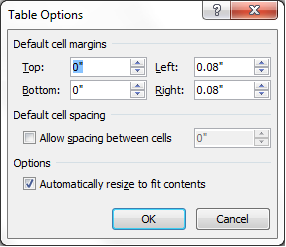
The fields Top, Bottom, Left, and Right control the distance between the cell border and the text within the cell. The space is also referred to as cell padding, which is white space. White space enhances the readability of a document. Thus cell padding makes the contents of a cell easier to read because a reader can readily distinguish text from border lines...think in terms of old eyes.
If you look closely at the details of rows in the samples below, you'll see that the second version is longer. Click the sample and you'll see that the second table has more white space above and below the text within the cell. To be precise, the top and bottom cell padding is 0.08". You'll need to play with these settings to see what you like. My preferred setting is 0.03" for all four settings.

Click the graphic to see a larger version of it.
Press the ESC key to return to this post.
Press the ESC key to return to this post.
If you stop and think about this, you already know another way to control the space before and after text...our good old friend Styles. If you create a style named TableCell, you can use it to control the space before and after text with the style applied to it. In addition, if you create a style names TableHead, you can add the bold attribute and apply it when you apply the style to the heading line of a table. Creating styles to control space and attributes is yet another example of the choices you make when deciding how to affect text in a document. The choices are what make Word so useful to its many fans.
Default cell spacing (Allow spacing between cells)
Click the check box to enable the size-field arrows (called spinners). The size field defaults to 0.01. Change the setting to 0.03 and then click OK to apply the setting. Word creates a table within a border. This option is one of the decorative elements that you can use to create interesting table layouts.
Accept the default to have the table resize itself automatically based on the size of cell contents. This option applies to eventual width of the table. I never use this control. There are too many other places where you can control width that are much easier to display and use than this particular control.
What You Should Take Away
Controlling cell padding adds to the readability of your tables and you have one option on the Table Options dialog to create a decorative table.
Next Post
We'll be looking at the next tab on the Table Properties: Row. This tab includes options that are useful for long tables that cover more than one page.
Saturday, March 10, 2012
PicMonkey
I received an email announcing that PicMonkey has launched. If you want to play with it, go to www.picmonkey.com. So far, it's basic; however, this is only the first salvo. I'll be watching this site to see what they offer.
Subscribe to:
Posts (Atom)